Monday 3 November 2014

Sean Sims - Editorial Illustrator

Sean Sims is an professional illustrator who creates designs that go on to be featured in editorial, and other commercial sectors.

Sean originates from Teeside, and operates from Brighton.
His retro designs are akin to "1970's primary school library-esque".

https://fishinkblog.files.wordpress.com/2014/04/fishinkblog-7409-sean-sims-1.jpg?w=600 < image reference at this link.

He came into the lecture theatre today, and gave a talk to a full room of students.

http://www.creativereview.co.uk/images/2013/11/sean_sims_05.10.13_0.jpg < image reference at this link.
He works with a large range of national, and international clients, including the Guardian, Paperchase, the Discovery Channel, and The BBC.

It was very interesting to hear his take on the world of the editorial sector, and he gave a lot of information on how he entered the field, as well as what a lot of editorial companies look at, when it comes to their illustrations.

He told the audience that very often, advertising and editorial agencies that are looking for illustrations to go alongside their articles, choose simplistic, but colourful designs.
Sean's works is a good example of this style, which can be seen in many different editorials today.

http://modculture.typepad.com/.a/6a00d83451cbb069e2015390ed8e81970b-800wi < image reference at this link.


As well as producing work for the editorial sectors, he creates a lot of designs that go onto be featured on cards, such as the one above.

Over the course of the lecture talk, he showed a vast amount of work, and it was very interesting to see a successful illustrator, and how he works in the industry.


http://www.artrepublic.com/biographies/265-sean-sims.html


Thomas.

Friday 31 October 2014

A Market For My Items

One very important thing that I must consider, now that all of my criteria of the brief has been fulfilled, is where my items could fit in he market.

I will start first by talking about locations that the album, featuring my design, could be sold in.

Album:


There are multiple ways that I could get my album to market. Firstly, I will state that this is all hypothetical, as I don't own the rights to Kate Bush's music, but for the sake of this blog, lets say that I somehow do have the rights.

If I wanted to get my vinyl into production, I would need to contact a company that specialises in vinyl production. There are multiple companies that I could go to, and below I will list a few of them.

  • Breed Media < http://www.breedmedia.co.uk
http://www.breedmedia.co.uk/product/12-inch-vinyl-pressing-printed-sleeves < image reference at this link.
  • DMS < 
http://www.discmanufacturingservices.com/vinyl-home.htm < image reference at this link.

  • GZ Media < http://www.gzmedia.com
http://www.gzmedia.com/Technical-support/Technical-conditions/Technical-conditions/Vinyl-record.aspx < image reference at this link.

Lets say, for example I wanted to produce a bulk of 3000 copies of my vinyl album, complete with packaging.
In order to get a price quote, I would need to contact a chosen company from my list.

Once receiving a quote, I could go ahead with production, and after paying the fee, and submitting my designs with bleeds, they would take care of the rest.

There are many different retail outlets that I could sell the album in.
For example, such physical stores, including HMV, major supermarkets, record shops, and other small media stores.
http://static1.demotix.com/sites/default/files/imagecache/a_scale_large/1800-4/photos/1361016953-66-hmv-stores-set-to-close-in-uk_1801264.jpg < image reference at this link.
http://static.guim.co.uk/sys-images/Media/Pix/pictures/2013/1/18/1358519155056/HMV-008.jpg < image reference at this link.

http://static.guim.co.uk/sys-images/Lifeandhealth/Pix/pictures/2006/12/21/9DanChung.jpg < image reference at this link.
Physical outlets offer less choice, however when looking into the realm of the online outlets, the locations where the album could be sold increases immensely.
Such online site such as Amazon, ebay, Zavvi, online websites operated by traditional retail outlets, there are just too many locations to list.

http://www.amazon.co.uk/music-rock-classical-pop-jazz/b?ie=UTF8&node=229816 < image reference at this link.
http://www.ebay.co.uk/sch/Music-/11233/i.html?_from=R40&_nkw=&rt=nc&LH_BIN=1 < image reference at this link.

---------------------------------------------------------------------------------------------------------


Editorial Illustration:


My final editorial with a 5mm bleed.

In order to get my editorial illustration to be used in an editorial, (whether online or in a traditional newspaper), I would need to become an editorial illustrator.


http://www.creativebloq.com/career/become-editorial-illustrator-121310155 < image reference at this link.

http://www.creativebloq.com/career/become-editorial-illustrator-121310155

The link above has great info on how to become part of the field, which is broken down into 5 steps.
It is a very informative weblink, that goes in depth.

My editorial illustration is music based, as it is based on 'Hounds Of Love'.
Therefore my editorial illustration will be part of a musical editorial. These are very common in music magazines, as this format is a dedicated toward music.

Such music magazines, include the following below.

Mojo Magazine.
https://blogger.googleusercontent.com/img/b/R29vZ2xl/AVvXsEjPh9OSlCqUvSyFPMBKFcGSkb0bzYAZ0Tlmnb-6U7m20Y1biAy0T3M0w4SyQgj3-FR2Ph0nAMp-FjNgQBaH_tmOAWNaJ942ju_pxlsjIkpgkBSO46ZpZ8AD2KWnrG1ujgZZ6zN7A5RDSa4/s1600/2011.jpg < image reference at this link.
http://www.ukmagz.co.uk/magz/Q%20.jpg < image reference at this link.

Such music oriented editorials based online, can be seen noted below.

http://www.qthemusic.com < image reference at this link.
http://pitchfork.com < image reference at this link.

---------------------------------------------------------------------------------------------------------


Poster:


Poster with bleed, if you look you can see guidelines in each corner.

My poster could be sold alongside the album in retail, and could also be used as a form of advertisement, promoting the album.
My A2 poster could be sold in such stores as HMV, WHSmith, (as they sell posters too), and could also be sold online through such online outlets as eBay, and amazon.

http://www.whsmith.co.uk < image reference at this link.


http://www.lowcostdisplays.co.uk/avactis-images/poster-tubes.jpg < image reference at this link.
Like with discussing where my album could be sold online, the list of locations that could sell the poster is just far too long to mention, the internet is global, with millions of different outlets to choose from. This is good news for my poster, and other products however, as this means that there is a huge audience.

http://www.gbposters.com < image reference at this link.
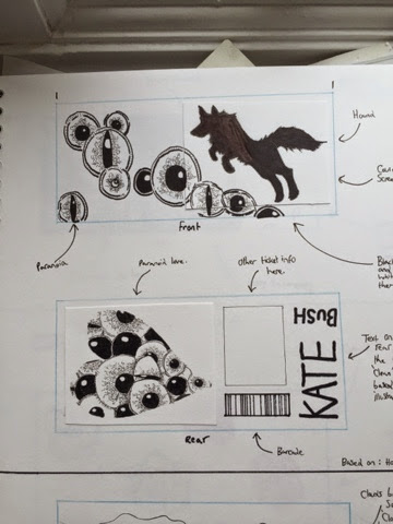
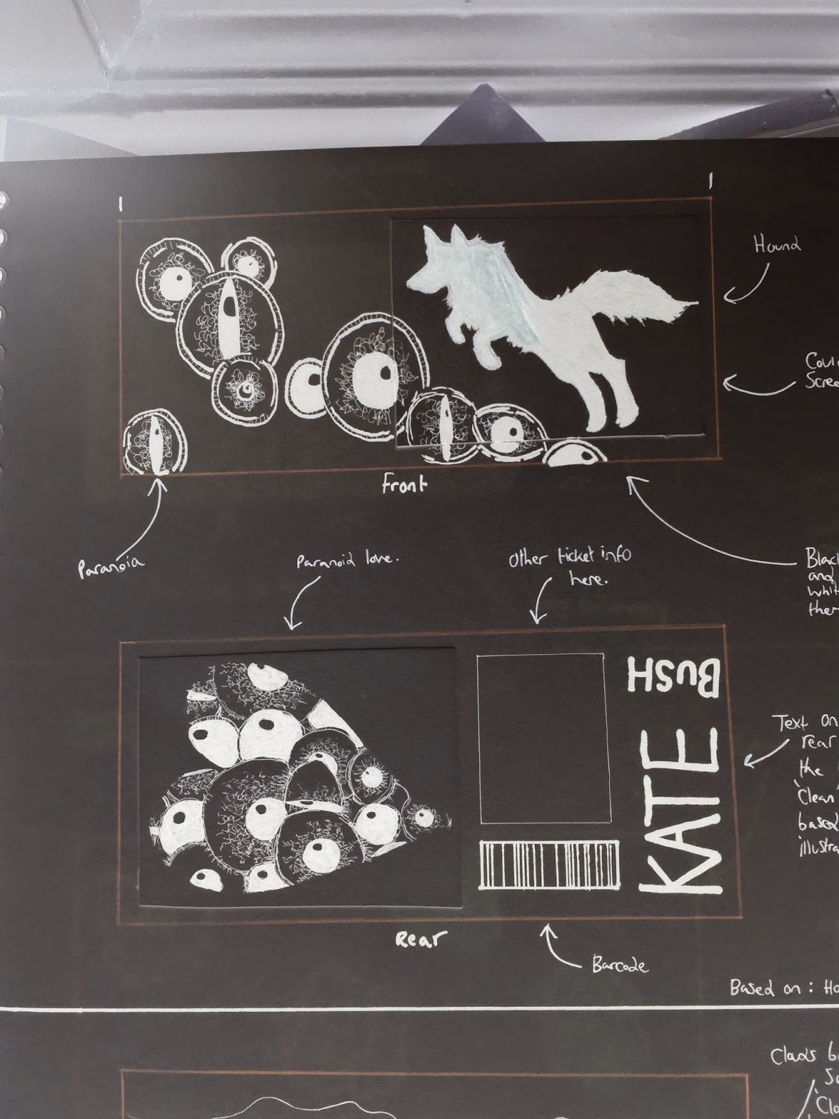
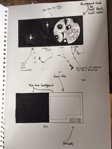
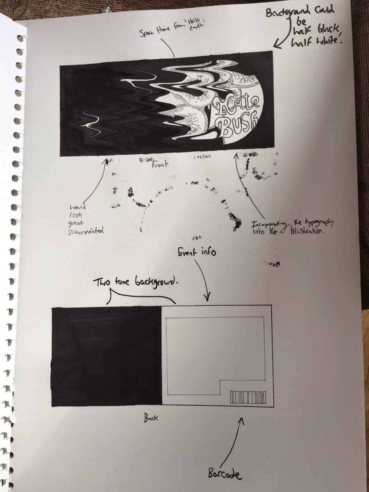

---------------------------------------------------------------------------------------------------------


Ticket:


My ticket would be sold to consumers, from an official ticket vendor like eventim.
It could be rolled out online, or from a physical venue.

I bought the tickets above via eventim's website.


Thomas.

Thursday 30 October 2014

Elly Walton - Editorial Illustrator


http://www.ellywalton-illustrations.com/146691/about-me < image reference at this link.

Elly Walton is an English editorial illustrator based in Derby, which is in the UK.
She is an established illustrator, who has had over 10 years of experience, and prior to her illustration role, she was an art director for several advertising agencies.

Her work contains a lot of traditional medium use, and she also uses digital software in her work.

She has had a number of magazine editorial clients, ranging from the likes of Which?, MacFormat, Moneywise, Waitress Weekend, PC Pro, The Guardian, Timeout London, and Thomas Cook.

http://www.ellywalton-illustrations.com/146689/1370176/portfolio/selected-highlights-editorial < image reference at this link.
The illustrations above featured on both pages, were featured in an article discussing the catering of the London 2012 Olympic Games, and was included in an editorial format called 'Delicious Magazine'.

https://www.cookie.com.au/cache/accc3cb269f82a5ab3f473b444c017e4_w1275.jpg < image reference at this link.

Other clients spanning different sectors, which include books, include Ransom Publishing, and Crown House Publishing.

Her awards include:
  • AOI "Images" Jury-selected annual 29, 31
  • Cream "Best illustration in a print ad" Silver
  • Creativematch "Flair" winner 2010, 2012

http://www.ellywalton-illustrations.com/146689/portfolio < image reference at this link.

Her contact information can be seen on the illustration above, which is featured at the link provided via the caption.

I really like her work, it has a heavily cartoon appearance to it, which is a style that I like.
Some of her work features the usage of 'flat' design styles as well, it is worth noting.
This design style is common in today's fashion, so she has adapted her self to move with fashion.


http://www.ellywalton-illustrations.com/146691/about-me < blog research, referenced at this link.


Thomas.

Wednesday 29 October 2014

My First Screenprint

As I previously had a bit of bad luck with the idea of my screenprinting my poster/album cover/ ticket etc last week, I felt very disappointed as I thought I wouldn't be able to incorporate the printing process into my work for this module.

After completing all of my designs with the intention of taking them to print, I noticed after discussing the process via a consultation with Jade, that my images would be impossible to screen print, due to the use of different tones in my final illustrations.

I decided to go ahead with digitally printing my designs, which is still a very good method of printing at a high quality, and allows for more detail and tone to be used with no issue.

My digitally printed album cover.
I still wanted to do some form of screenprinted image, so I went down to the print room to talk to Jade. I decided to create a new illustration based on the imagery of a rodent, to put in my portfolio.

Sketching out the illustration on acetate paper, using a very fine black pigment pen.
I illustrated directly onto a piece of acetate, using an assortment of thin, super black pigment pens.

After this, I used solution on a mesh frame, and then after drying, exposed the illustration to the photo sensitive solution.


After using the vacuum machine, and then applying the exposure light, I left the mesh to 'burn' for about 20 seconds.

After taking the exposed mesh out, I quickly washed out the areas that I didn't want ink to fill, by using the jet wash.
This was a process that took around 5 minutes, and I accomplished a fine mesh print, to work with. This made me happy.

After letting the mesh dry, I inked up the screen printer, and used the squeegee tool to pull ink across the mesh, then pushed the squeegee, to 'fill' the mesh.
Now the image was ready to be printed, and I made 4 copies, with one appearing too saturated of ink, due to me overfilling the mesh.

The over flood copy, which caused ink bleeding.

Overall I am very happy with the screen printing process, and I now feel more comfortable with working in this method, in the future.
I feel like I can from start to finish, independently screenprint.


Thomas.

Monday 27 October 2014

Product Development #4 (Digital Manipulation)

To progress with the development of my product, I will be using adobe photoshop to manipulate the concepts that I picked in an earlier blogpost.

I chose four different concepts to progress with, so I shall be using adobe photoshop to manipulate the images, to see how I can enhance each one, using different techniques.

I will start by digitally manipulating the first concept I chose, concept #1.


Concept #1:

Before.
After
By going to image > adjustments > invert, I was able to invert the tone of the original image, to that of the image below.


I think that this manipulation makes the design appear to have elements of fear. This is great, as there are a few scary elements in songs from the album, most notably 'Waking the Witch', which I found to be quite a dark song.


------------------------------------------------------------------------------------------------------------------


Concept #2:


Before

The trace contour tool.
Using the trace contour tool, I was able to take out the black of the pupils. This look makes it

After


Before


By using the gradient map, which can be found by going to image >
I was able to drastically change the tones featured in the image, applying colour on a concept that originally was only illustrated in black and white.

After
This image is highly colourful, and is a stark contrast to many of my concept developments.

------------------------------------------------------------------------------------------------------------------


Concept #5:


Before
After
Turning the black into a red hue really gives this design an element of danger in my opinion, as red has a general connection to danger.
I feel that it works with the theme of paranoia.

------------------------------------------------------------------------------------------------------------------


Concept #6:


Before

I used the liquify brush tool, in order to stretch and warp the concept illustration.

Using this interesting photoshop tool.
After
The tool allowed for a heavy amount of precision manipulation, contorting lines, and shapes.
It is very similar to a process that I experimented with earlier, using a tool called wind.

In the next blog discussing further product development, I will be choosing a concept to base my final product on.


Thomas.

Sunday 26 October 2014

Final Poster Design

My poster designs for the album, 'Hounds of Love', are now fully complete.
As the brief states, there needs to be two digital versions of the poster. 

As a bonus, I will be printing my A2 version of the poster out to scale, and will be including it with my hand in box.

Criteria from the brief.
The first version is one that is in an A2 format.
The second version is one to be submitted digitally in a square format, that is 400px x 400px, at a resolution of 72dpi.


A2 Poster:

Poster with bleed, if you look you can see guidelines in each corner.


My poster is also included as a print out, and can be seen in my hand in box.
For the digitally submitted file, I added a 5mm bleed to my poster, using Adobe Photoshop.

Adding a bleed in photoshop.

As you can see by the ruler, there is a 5mm bleed.

The size of the canvas is exactly A2, but the image had to be shrunk down in order to incorporate the bleed.

------------------------------------------------------------------------------------------------------------


Square Poster (400x400 px):


Initial square format with text.

In industry, it is often common when developing a poster, to produce a square based version, to be used as a thumbnail. Initially I simply cropped my poster, and downscaled it to match the required aspect ratio.
However, I realised that the text was a big issue, as it was very hard to see. I had two choices, I could make the text bigger, however there was a risk of taking away the boldness of the design, and also of it still being difficult to read.
The other choice, was to remove the text completely, as I felt that the image was strong enough to not require the dependence on typography.
The updated square format poster can be seen below.


Thomas.