Showing posts with label Product. Show all posts

Monday, 27 October 2014

Product Development #4 (Digital Manipulation)

To progress with the development of my product, I will be using adobe photoshop to manipulate the concepts that I picked in an earlier blogpost.

I chose four different concepts to progress with, so I shall be using adobe photoshop to manipulate the images, to see how I can enhance each one, using different techniques.

I will start by digitally manipulating the first concept I chose, concept #1.


Concept #1:

Before.
After
By going to image > adjustments > invert, I was able to invert the tone of the original image, to that of the image below.


I think that this manipulation makes the design appear to have elements of fear. This is great, as there are a few scary elements in songs from the album, most notably 'Waking the Witch', which I found to be quite a dark song.


------------------------------------------------------------------------------------------------------------------


Concept #2:


Before

The trace contour tool.
Using the trace contour tool, I was able to take out the black of the pupils. This look makes it

After


Before


By using the gradient map, which can be found by going to image >
I was able to drastically change the tones featured in the image, applying colour on a concept that originally was only illustrated in black and white.

After
This image is highly colourful, and is a stark contrast to many of my concept developments.

------------------------------------------------------------------------------------------------------------------


Concept #5:


Before
After
Turning the black into a red hue really gives this design an element of danger in my opinion, as red has a general connection to danger.
I feel that it works with the theme of paranoia.

------------------------------------------------------------------------------------------------------------------


Concept #6:


Before

I used the liquify brush tool, in order to stretch and warp the concept illustration.

Using this interesting photoshop tool.
After
The tool allowed for a heavy amount of precision manipulation, contorting lines, and shapes.
It is very similar to a process that I experimented with earlier, using a tool called wind.

In the next blog discussing further product development, I will be choosing a concept to base my final product on.


Thomas.

Thursday, 23 October 2014

Final Ticket Design

After creating a lot of necessary product development, I have finally completed my product design, in the form of a limited edition ticket, promoting a hypothetical Kate Bush concert.

The ticket was developed in two separate parts, a front and back design that have since been pieced together to form a double sided product.

Below are the designs for each side of the ticket, starting with the front.


Front:
The front design of my ticket product.

Back:


The rear design of my ticket product.

I have placed them onto a single 'sheet' in photoshop, with the 5mm bleeds, for comparison

Both of my designs on a single page.

My ticket design incorporates the use of the eventim logo, this would be classed as copyright if I used it outside of an academic environment, the log can be referenced at the following link.

http://ticketnews.eventim.co.uk/wp-content/uploads/2013/09/eventim-apollo-logo.jpg < logo referenced at this link.

I have been trailing with the printing of my ticket, by using photoshop, as well as some cartridge paper just to test with.

Front of my ticket.

Rear of my ticket.
This was just a rough print, just to make sure my ticket is 18.6cm x 8.2cm.
As you can see I haven't cut very precisely in the tester, something I will need to line up better for next time.

For the final ticket, I used a type of card that had a higher level of GSM.
There are no professional tickets out there in the market, that contain poor and flimsy paper, so this is reflecting what I have taken from my ticket research.


Overall I am very pleased with my ticket product, I think it ties in well with my other products, and also matches my intended audience perfectly.


My ticket is at the dimensions that I planned on working with, those being 18.6 x 8.2cm, minus the 5mm bleed.


Thomas.

Product Development #6 (Final Product)

All of my product development has led up to this conclusive blog, which features my final product design.

My product of choice to develop upon for the brief, was that of a limited edition ticket, for a hypothetical Kate Bush concert.
I researched everything that I felt I needed to, from screen printing, to ticket size, and contents.

Studying ticket dimensions for research.

I feel that my product development has really aided me in coming up with a contemporary design that both compliments the product, whilst also complementing, and suiting the artist.

From the very start of the product development, I knew that the design needed to be very important, as it has to be able to entice customers.

The final design combines typography, with a two tone colour scheme, and themes that refer to a number of songs found on the album that it was based on.
The rear design resembled the front, and I left some space available in order to incorporate ticket information, such as the venue, seat number, and date.

I believe that my final design has a contemporary appearance, and this is mandatory to match both my audience, as well as fit the criteria of the non-narrative brief.

The front of the ticket, like the back, has a split two tone black and white appearance, with one half in white, and the other in black.
I used a leaf brush tool to provide some visual appeal to the black side of the ticket, and leaves incorporate the album's theme, as you can see this across all of my existing concepts and developments, not just in the product blogs.

Front of my illustrative based ticket.

The illustration on the right side is directly influenced by my developmental concepts, and incorporates typography into the illustration.

The rear of the ticket is very important to the design, as it is the side of my ticket that will highlight all of the event information, as well as the barcode and the event company logo.

Rear of my ticket.

To help with the development of the rear of the ticket, I looked at some existing tickets by the 'Arctic Monkeys', as well as an official Kate Bush 'Before the Dawn' concert ticket I found online.

Arctic Monkeys ticket.

http://rickwakemanscape.files.wordpress.com/2014/09/katebushticket1.jpg < image reference at this link.

I noticed that certain pieces of information on the ticket stood out more than others.
For example, such important info as the date, event, seating location, as well as the artist/band name, were larger in size, and often in a bolder setting.
I incorporated this information on my ticket, using what I learnt from the example tickets, and also took into account the font.
The font I wanted to resemble that of the album, poster and editorial, however I wanted the text to be very legible and clear.
I used some of the stylised text on such information as the artist's name, however stuck to a very clear font for the other information.


The font from the original 'Hounds of Love' album is the pink text, whilst the font used on my album/poster/ticket, can be seen underneath. My font type was called 'Apple Chancery Chancery'.

There are barcodes featured on both example tickets as well, and I thought it would be professional to place one on my product as well.
I went online to a barcode generator, in order to come up with a barcode for my ticket.

http://www.barcode-generator.org < image reference at this link.
Inputing in the words Hounds Of Love, allows me to come up with a professional looking barcode, which can be seen below.

http://www.barcode-generator.org < image reference at this link.

This barcode will be placed directly on the reverse side of my ticket, near the event info.

I aim to have my final ticket screen printed.
I have already talked to Jade about how I could go about with the process, so I will create a new blog when the time comes to print the product.


Thomas.

Tuesday, 21 October 2014

Product Development #2 (Concepts)

For my product concepts, I will be basing the designs of the limited edition printed ticket around the album, 'Hounds of Love'.

This product will be a ticket for a theoretical live event, and I will judge the size of my ticket around an existing ticket that I came across, in order to get a realistic size to work with.


Measuring the existing ticket.
The ticket above, (that I am using as reference), has the dimensions of approx 18.6cm (W), by 8.2cm (H).

Ticket outlines in my concept book, which I will use to place the concepts onto.
The ticket feels well made, and contains card with a high GSM.
I have used these dimensions to come up with the base size for my limited edition ticket product.

As well as dimensions, I must also think of what needs to be on a ticket.
Going by the example ticket above, I see such features as a bar-code, seat and ticket numbers, as well as price.

Concept #1:


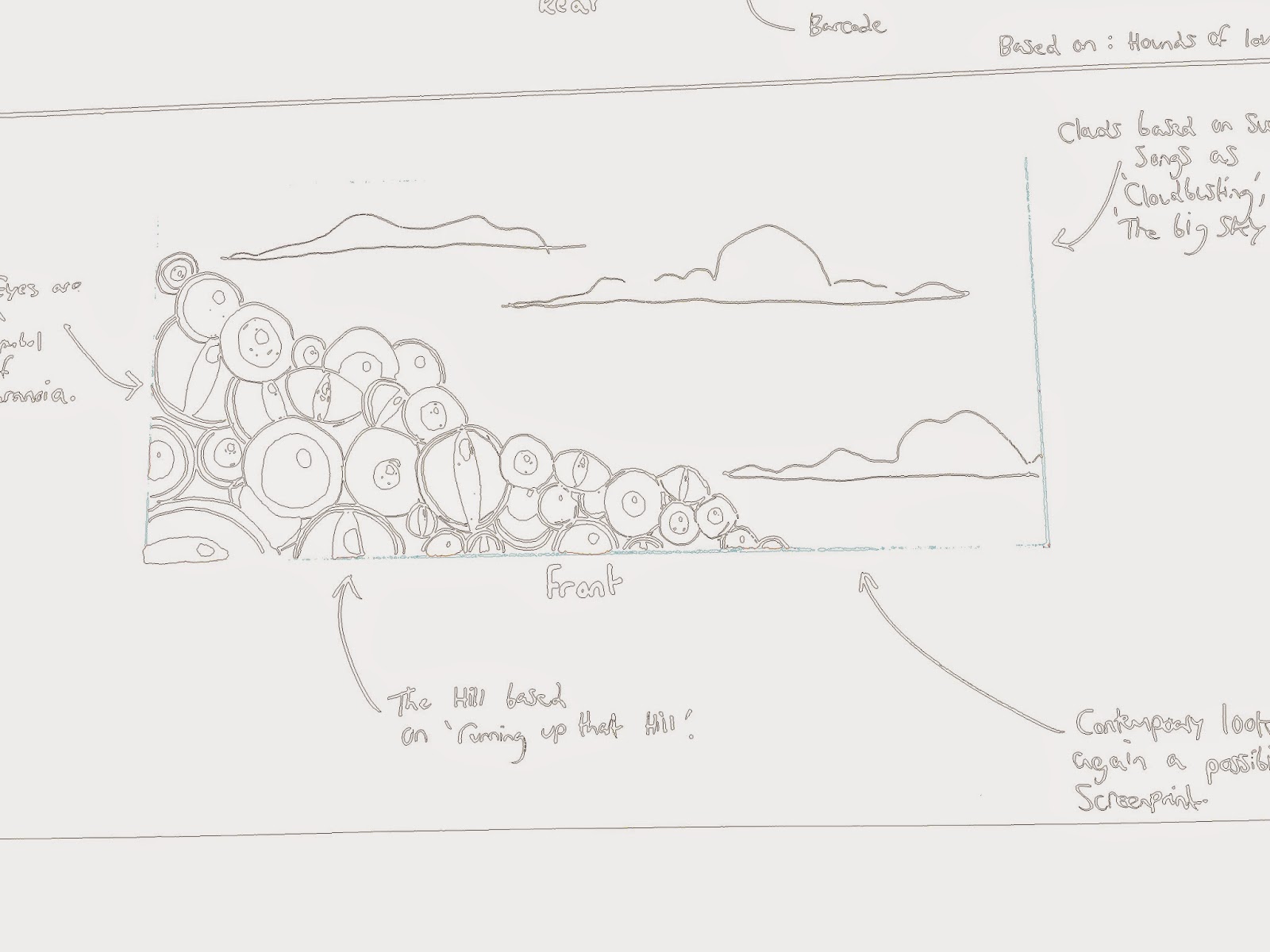
For the first concept, I based the ticket design around the song, 'Hounds of Love'.
I thought about using similar themes to the album.

The concept features illustrations on both sides of the ticket, and has the black and white style that I have been working in a lot over the course of this module.
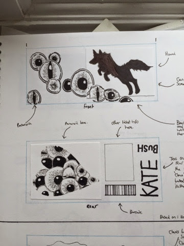
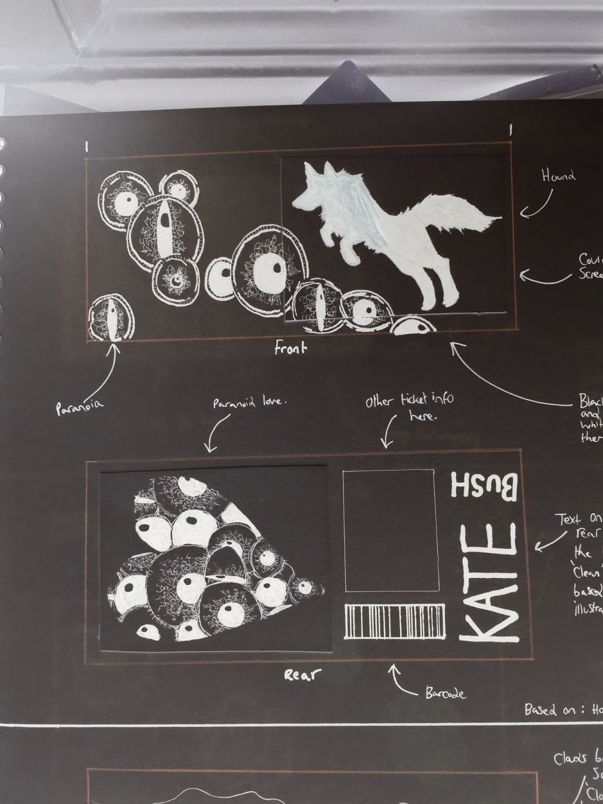

-------------------------------------------------------------------------------------------------------------------


Concept #2:


Front


Back


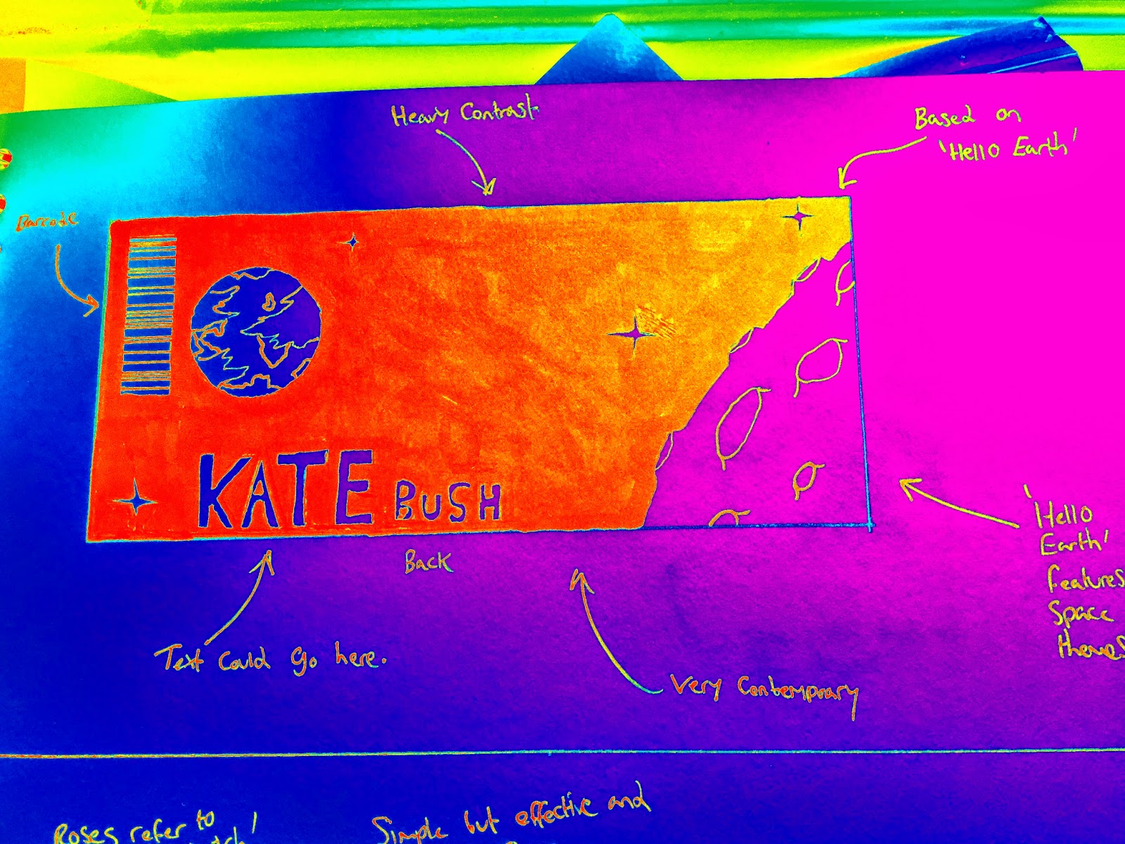
This design consists of 2 large illustrations being featured on both sides of the ticket, and interestingly, this ticket concept incorporates themes from 2 different songs featured on the album, (Those songs being 'Running Up That Hill' (A Deal With God), and 'Hello Earth').

The fact that this design incorporates two designs makes this concept appealing, however, this comes with a compromise, as there is less space to apply ticket information, which is required for a ticket.


-------------------------------------------------------------------------------------------------------------------


Concept #3:


For the third ticket concept, I wanted to base the entire design on a lyric from 'Waking the Witch'.
In the song, Kate sings the line, "Red red roses, pinks and posies", and this line makes me think of flowers, particularly roses.

I wanted to suit my rose sketches to a contemporary audience, and I know that a simplistic design would be part of the contemporary style.
On the rear of the ticket, my design incorporates illustrative based typography.

I am not fond of this design, I feel as if this concept doesn't do the album justice, and it doesn't tie in well with my designs for example, the album.
Because of this, I will not be progressing with this design.


-------------------------------------------------------------------------------------------------------------------


Concept #4:


For concept #4, I used the theme of natural forms again, and created the imagery of a tree, with eyes for the leaves, the eyes of course referring to the paranoia themes found in such songs as 'Hounds of Love'.

The reverse side of the ticket uses similar elements of concept #3, by incorporating typography into the illustration.

Like the last concept listed, I am not fond of this design. There is too much white on the ticket, I don't think that the illustration covers enough of the design.
I want my design to be bold, and I just don't feel that this design is striking enough.


-------------------------------------------------------------------------------------------------------------------


Concept #5:


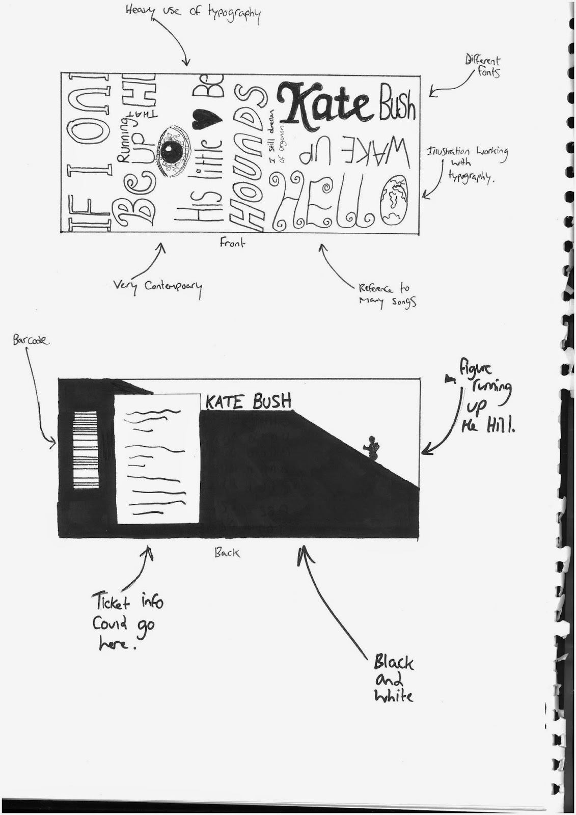
Concept #5 features a heavy use of typography.
I wanted to create a concept that focused on typography, because I thought it would be interesting to create a design that contained a few lyrics from songs on the album.
There are references to such tracks as 'Hounds of Love', 'Running Up That Hill', 'Cloudbusting', and 'Hello Earth'.

It is a very strong design, that I think might not work as the final design as it lacks an illustration.
However I could take some of the elements of typography from this design, and place it into the final design for my ticket product.
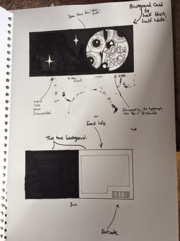
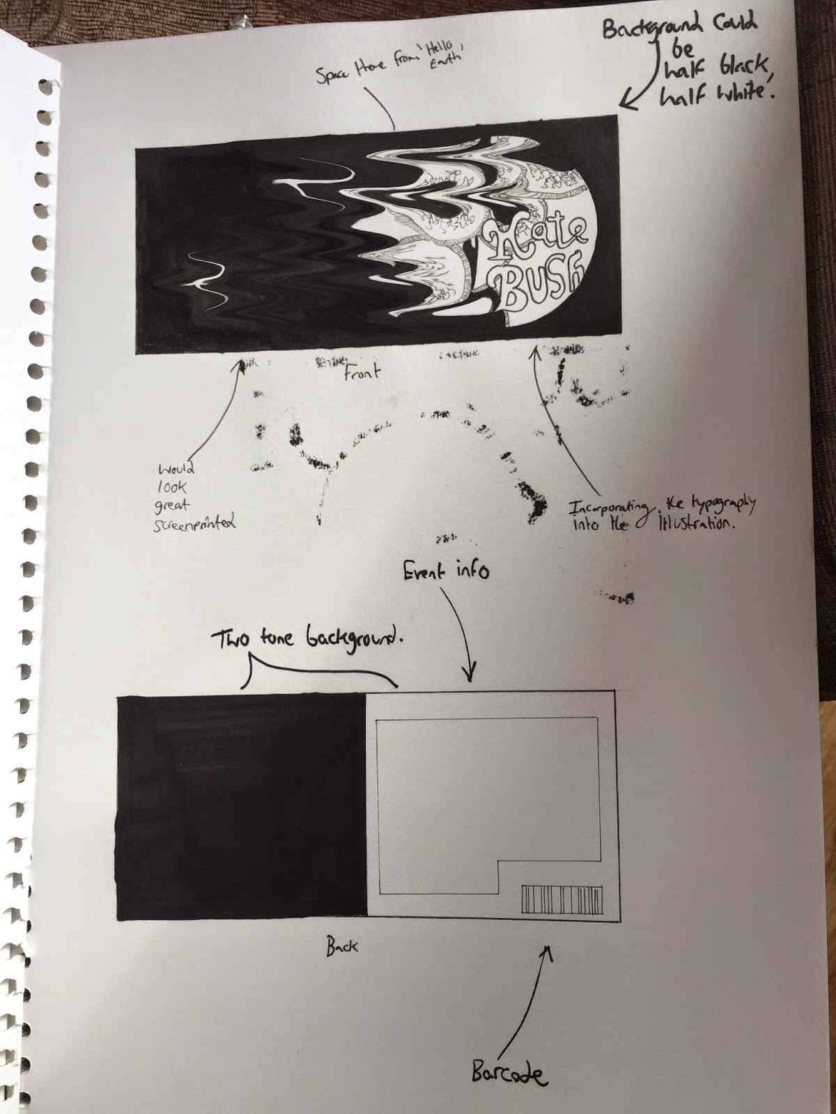

-------------------------------------------------------------------------------------------------------------------


Concept #6:


My last concept for the development features an illustration that incorporates the use of typography.
It revolves around the imagery of space, connecting the design to 'Hello Earth', and the theme of paranoia which refers to the song 'Hounds of Love'.

It is a similar style to the illustration featured on the rear cover of the album design, which again mixes typography with illustration.

Unlike concept #4, I feel like this design is much more bolder, and I really think that the two tone colour scheme, especially on the back, is very eye catching.
Perhaps I could incorporate the use of tone featured on the back of the ticket concept, and experiment with this on the front.


-------------------------------------------------------------------------------------------------------------------


It is worth noting that my concepts are draft representations of what I could use as my product design.
They are used as as a way to progress in development, leading up to a final product.


Thomas.

Monday, 20 October 2014

Product Development #5 (Choosing a Concept)

For my product, which is the idea of creating a limited edition print as a ticket for a hypothetical Kate Bush venue, I have finally decided which design would be most suiting to base my final on.

It is a design that incorporates several elements from different songs found on the album, as well as including some typography which is 'woven' into the illustration, similar to the detailed leaf on the back of my 'Hounds of Love' album cover design.

I decided to choose elements from concept #6 as the design to go with for my final refined product.
I really cannot wait to see this design as my ticket, in my opinion it reflects the album, artist, and suit my target market the most.

I would like to see this design printed onto card, using the screen printing process. I am inexperienced with this method, so I will need to talk to Jade in order to be schooled with using the large printer in the print room.

The chosen design uses some elements from previous work, most notably from the illustration that can be found on one of my unused album cover concepts, and also an illustration on the rear of my final album cover.
The first album concept that wasn't used in the final album design.
I really liked this idea, so I will be using some elements from it on my product design.

Rear album cover illustration.


Another concept that inspired the choice of my final product design, is my 5th editorial concept, which uses typography as part of the design.

These three concepts and illustrations all inspired the development of my 6th concept ticket design, which is my choice to base the final ticket on.

Over the next few days, I will be piecing together the final product design based on my chosen concept, and in the next blog discussing my product, I will highlight my finished design, and hopefully have some pictures of my completed screenprinted ticket to show.


Thomas.

Saturday, 18 October 2014

Product Development #3 (Refining Concepts)

Of the assortment of limited edition ticket concepts that I came up with, I have decided to progress my development by selecting a few of the designs that I think has a strong chance of working as my final product.

Below are the concepts that I think worked really well in development, and stood out to me.

Concept #1:


I love the composition, and the silhouette of the hound jumping over the eyes.
I like how there is a smaller illustration on the reverse side of the ticket, which is where all the event information will go.

---------------------------------------------------------------------------------------------------------------------


Concept #2:


This design layout incorporates two illustrations into the design, which is something that I could look at for my final product.

This may not work as my final ticket design, as there is little space to put any event information on, however I do like the idea of having 2 good sized illustrations on the ticket, however if using this design type for my final ticket, I will need to leave some room for information.

---------------------------------------------------------------------------------------------------------------------


Concept #5:


This concept is very heavily reliant on typography, and whilst I feel as if the use of heavy typography may not work on its own as a final design, I could look at incorporating it into my final ticket product.

---------------------------------------------------------------------------------------------------------------------


Concept #6:


This concept incorporates several themes from a few of my other concepts.

This concept takes some elements from previous work, notably from the illustration that can be found on the rear of my album cover.

Rear album cover illustration.


As well as one of my unused album cover concepts.

The first album concept that wasn't used in the final album design.


I will be moving onto experimenting with the use of digital manipulation with my chosen concept designs, and I will talk more about this in my next blog.


Thomas.

Wednesday, 15 October 2014

Limited Edition Prints

Limited edition prints are defined by a limited number of prints struck from one plate.
Usually, limited edition prints have a fixed quantity number, with the intention that once this number has been reached, there will be no more prints of the edition re-printed.
This fact of 'rarity' makes the limited print run more valuable than for example, mass produced prints, where their stocks are constantly being replenished.

Such companies as Nobrow, deal in the sale of special edition prints, as it is a big market in the world of art.
I myself have purchased a few limited edition prints, with one being from Nobrow itself.

http://www.nobrow.net/wordpress/wp-content/uploads/2012/11/TMRB_full.jpg < image reference at this link.

Quite often, the print contains its unique number in the limited run, and is usually signed by the artist.

http://www.nobrow.net/category/products/limited-edition-prints?producttag=limited-edition-prints-2 < image reference at this link.


Limited edition prints usually go for much greater amounts of money, due to their rarity, as well as the process involved in creating them.

Another place in which limited edition print can be purchased, include the following.


  • http://www.artrepublic.com/tags/81-limited-edition.html
  • http://www.therosegallery.co.uk/?gclid=CLTi4-_5zcECFSPItAodU3wAEA
  • http://www.redraggallery.co.uk/limited-edition-prints.asp
  • http://whitecube.com/shop/
  • http://www.clickforart.com


This is product market that I could look at, in the development of my product concepts.


http://www.limitededitionprints.info < blog reference from this link, as well as those listed.


Thomas.