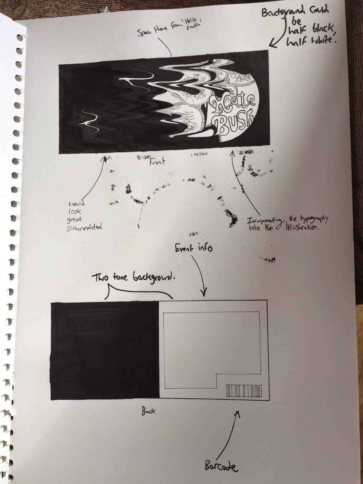
To progress with the development of my product, I will be using adobe photoshop to manipulate the concepts that I picked in an earlier blogpost.
I chose four different concepts to progress with, so I shall be using adobe photoshop to manipulate the images, to see how I can enhance each one, using different techniques.
I will start by digitally manipulating the first concept I chose, concept #1.
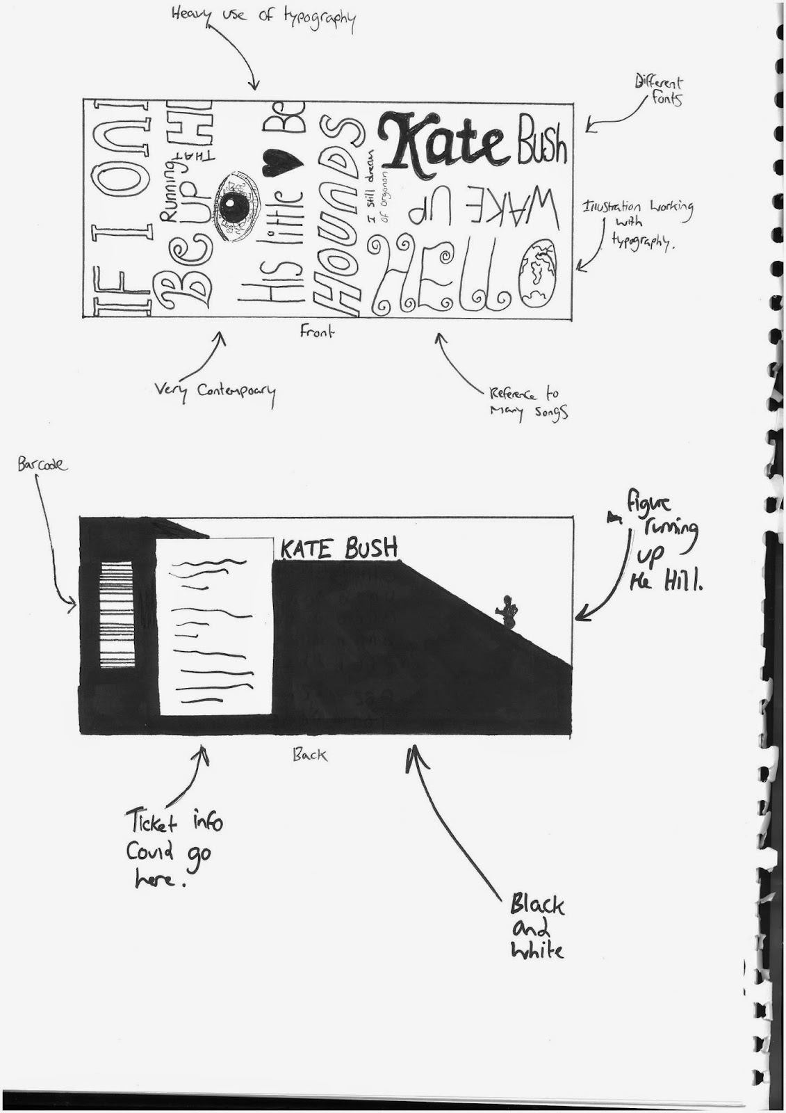
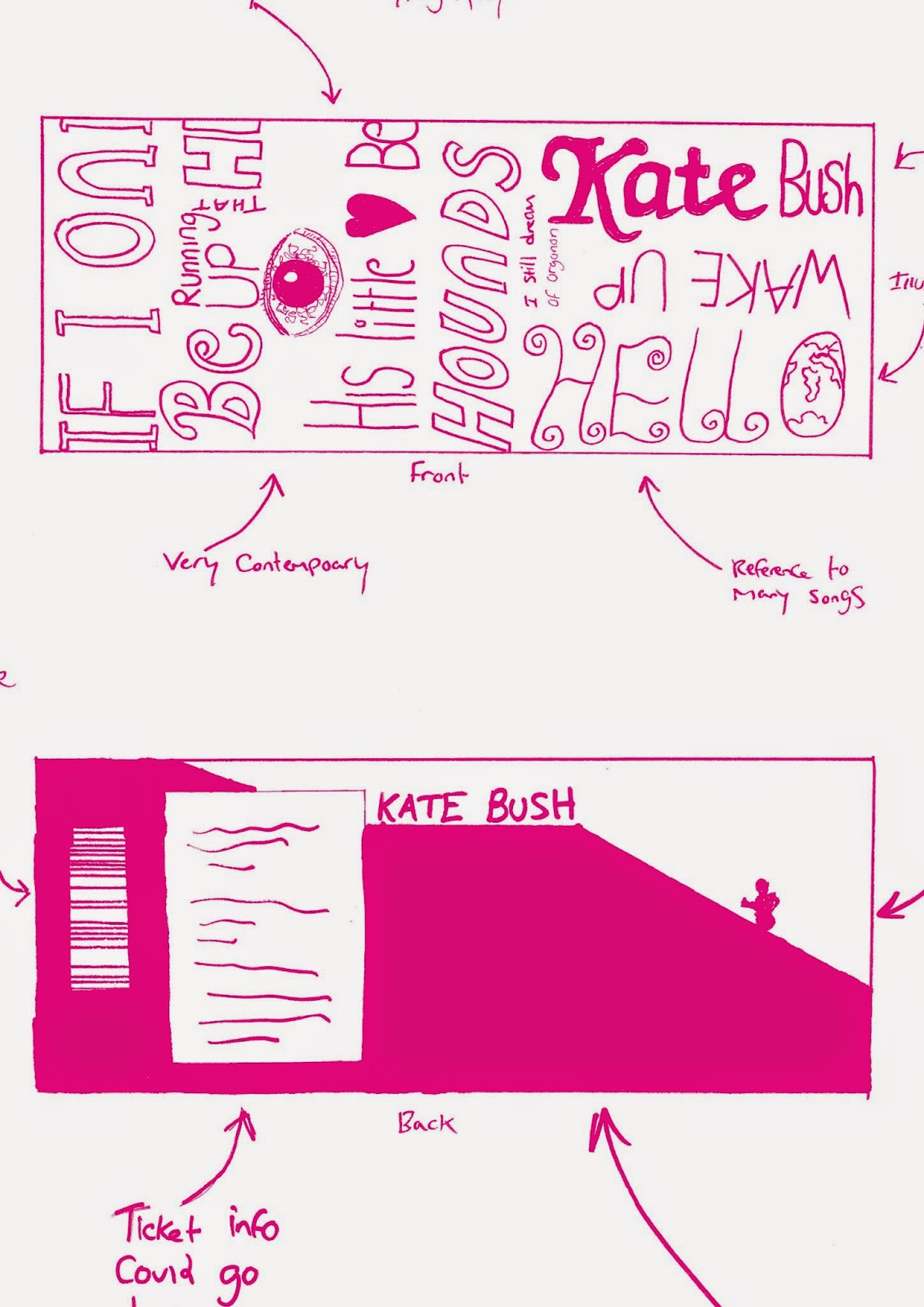
Concept #1:
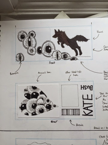 |
| Before. |
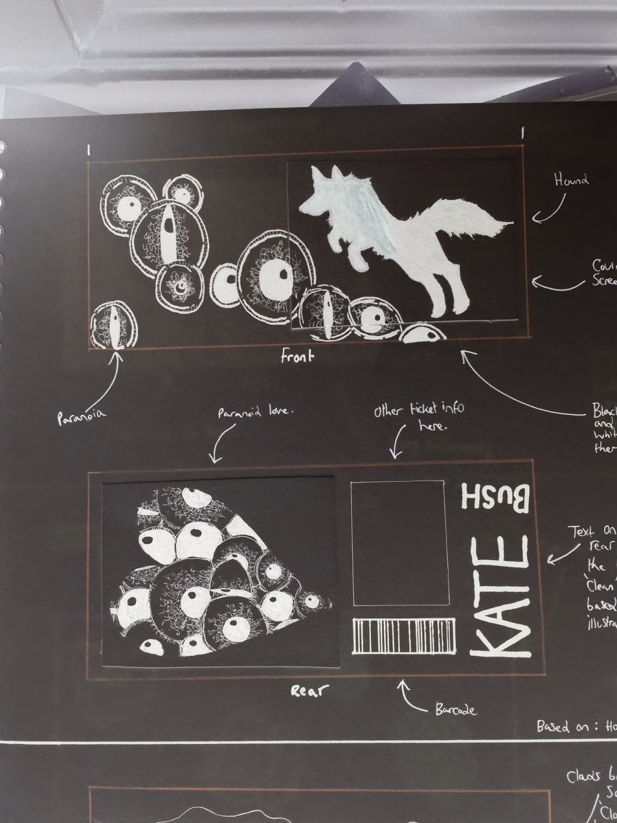 |
| After |
By going to image > adjustments > invert, I was able to invert the tone of the original image, to that of the image below.
I think that this manipulation makes the design appear to have elements of fear. This is great, as there are a few scary elements in songs from the album, most notably 'Waking the Witch', which I found to be quite a dark song.
------------------------------------------------------------------------------------------------------------------
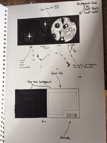
Concept #2:
 |
| Before |
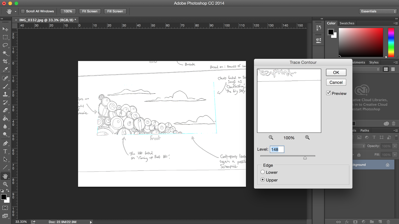 |
| The trace contour tool. |
Using the trace contour tool, I was able to take out the black of the pupils. This look makes it
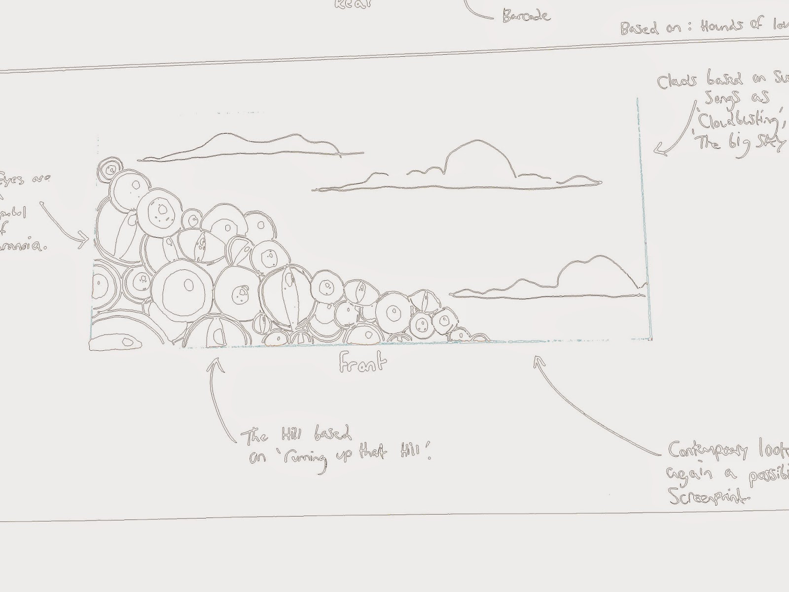 |
| After |
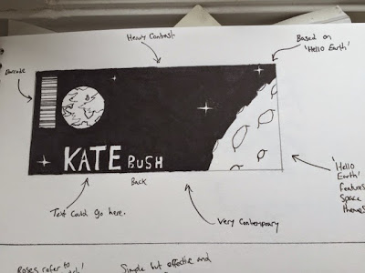 |
Before
|
By using the gradient map, which can be found by going to image >
I was able to drastically change the tones featured in the image, applying colour on a concept that originally was only illustrated in black and white.
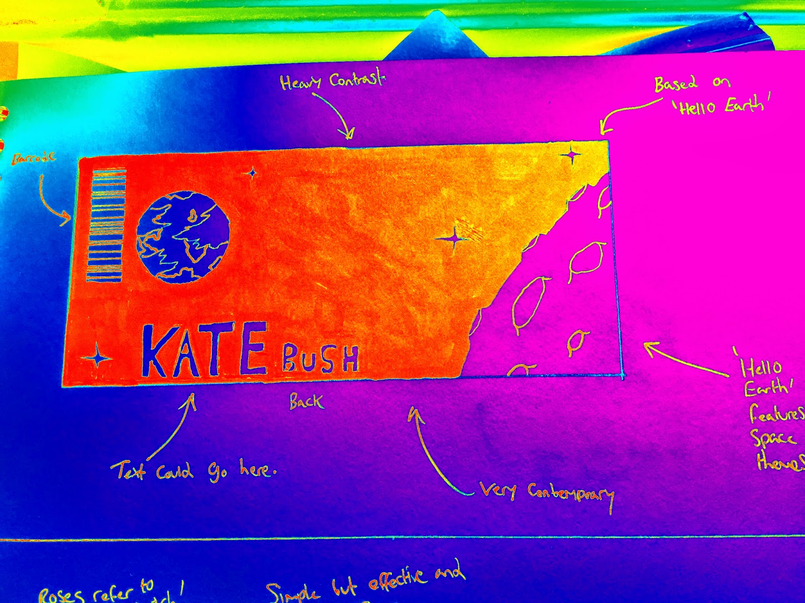 |
| After |
This image is highly colourful, and is a stark contrast to many of my concept developments.
------------------------------------------------------------------------------------------------------------------
Concept #5:
 |
| Before |
 |
| After |
Turning the black into a red hue really gives this design an element of danger in my opinion, as red has a general connection to danger.
I feel that it works with the theme of paranoia.
------------------------------------------------------------------------------------------------------------------
Concept #6:
 |
| Before |
I used the liquify brush tool, in order to stretch and warp the concept illustration.
 |
| Using this interesting photoshop tool. |
 |
| After |
The tool allowed for a heavy amount of precision manipulation, contorting lines, and shapes.
It is very similar to a process that I experimented with earlier, using a tool called wind.
In the next blog discussing further product development, I will be choosing a concept to base my final product on.
Thomas.


No comments:
Post a Comment