Below are the concepts that I think worked really well in development, and stood out to me.
Concept #1:
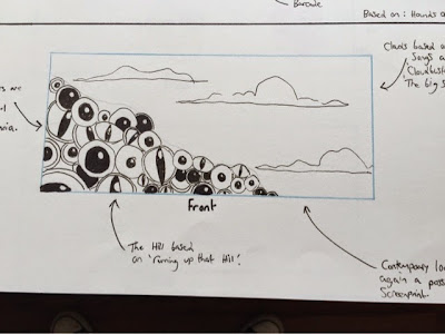
I love the composition, and the silhouette of the hound jumping over the eyes.
I like how there is a smaller illustration on the reverse side of the ticket, which is where all the event information will go.
---------------------------------------------------------------------------------------------------------------------
Concept #2:
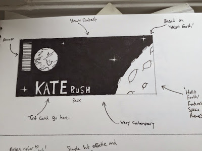
This design layout incorporates two illustrations into the design, which is something that I could look at for my final product.
This may not work as my final ticket design, as there is little space to put any event information on, however I do like the idea of having 2 good sized illustrations on the ticket, however if using this design type for my final ticket, I will need to leave some room for information.
---------------------------------------------------------------------------------------------------------------------
Concept #5:
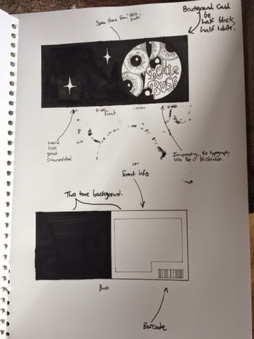
This concept is very heavily reliant on typography, and whilst I feel as if the use of heavy typography may not work on its own as a final design, I could look at incorporating it into my final ticket product.
---------------------------------------------------------------------------------------------------------------------
Concept #6:
This concept incorporates several themes from a few of my other concepts.
This concept takes some elements from previous work, notably from the illustration that can be found on the rear of my album cover.
 |
| Rear album cover illustration. |
 |
| The first album concept that wasn't used in the final album design. |
I will be moving onto experimenting with the use of digital manipulation with my chosen concept designs, and I will talk more about this in my next blog.
Thomas.


No comments:
Post a Comment