Showing posts with label advertising. Show all posts

Sunday, 26 October 2014

Final Poster Design

My poster designs for the album, 'Hounds of Love', are now fully complete.
As the brief states, there needs to be two digital versions of the poster. 

As a bonus, I will be printing my A2 version of the poster out to scale, and will be including it with my hand in box.

Criteria from the brief.
The first version is one that is in an A2 format.
The second version is one to be submitted digitally in a square format, that is 400px x 400px, at a resolution of 72dpi.


A2 Poster:

Poster with bleed, if you look you can see guidelines in each corner.


My poster is also included as a print out, and can be seen in my hand in box.
For the digitally submitted file, I added a 5mm bleed to my poster, using Adobe Photoshop.

Adding a bleed in photoshop.

As you can see by the ruler, there is a 5mm bleed.

The size of the canvas is exactly A2, but the image had to be shrunk down in order to incorporate the bleed.

------------------------------------------------------------------------------------------------------------


Square Poster (400x400 px):


Initial square format with text.

In industry, it is often common when developing a poster, to produce a square based version, to be used as a thumbnail. Initially I simply cropped my poster, and downscaled it to match the required aspect ratio.
However, I realised that the text was a big issue, as it was very hard to see. I had two choices, I could make the text bigger, however there was a risk of taking away the boldness of the design, and also of it still being difficult to read.
The other choice, was to remove the text completely, as I felt that the image was strong enough to not require the dependence on typography.
The updated square format poster can be seen below.


Thomas.

Thursday, 16 October 2014

Poster Development #6 (Final Poster)

All of my poster development over the past few blogs has led up to my final design.

I experimented with digital manipulation in an earlier blog, and I liked some of the outcomes.
I thought I would use digital manipulation to my advantage, in order to enhance my illustration.

By tweaking the colour level of the magenta, black, and the yellow, I was able to make a stunning design, that is very eye-catching, bright, and works well with the album.

The poster is based on a few tracks from the album, notably 'Hounds of Love', and Running Up That Hill (A Deal With God).


I really love my use of digitally manipulated colour here, as I feel like the yellow and red tones give off the impression of danger, and this helps to back up the theme of paranoia, and struggle in the design.
The paranoia and struggle themes are taken from numerous songs, but most notably 'Hounds of love', and ]Running Up That Hill'.
From what I gathered from the song 'Running Up That Hill', Kate is talking about running up the hill, if she only could, as it it is a reference to overcoming life's problems.

In the music video, (which suggests themes of an abusive relationship due to the male dancer shadowing her, and not allowing her to break free), it shows Kate as she struggles to escape, and later on in the video, whilst trying to pass through a corridor, hoards of people hinder her progress.

The poster is trying to convey the struggle of overcoming life's problems, which is what I gathered from the song.

https://www.youtube.com/watch?v=wp43OdtAAkM < video reference at this link.

I created this bold colour style by using my previous experimentation in digital manipulation, which inspired me to try to enhance the illustration using photoshop settings.

I created this style in a step by step process, which I will go over below.

After scanning my base illustration into Adobe Photoshop, I increased it in size to fit the criteria of A2.
The paper dimensions for A2 are 420mm x 594mm, and this can be set in photoshop by either creating a new document, and typing in the dimensions, or editing the canvas size after creation.
For my poster, I chose to select the size at the time I created the document.


After flattening the image layers, I went into the image 'curve' settings, and with my format channel being CYMK, I was able to tweak all four types of colour.


Here you can see me tweaking the CYMK settings, and manipulating the level of yellow tones.
By doing this, I was able to change the colour tone of the image.


I changed the colour of the background to black, and then I noticed that the white clouds just didn't seem to work with the other colours.
I thought about using red, as it would go with the yellow more, and also red is a colour that is often associated with love.
Since the poster is promoting 'Hounds of love', I thought this would work well with the poster nicely.


Straightening out the bases of the clouds using tools.


Thinking about suitable typography, I selected a font style that seemed to resemble the font found on the original 'Hounds of Love' album cover.
I loved the style of the text, so I wanted to find as close a match as possible.

The font style found on the original 'Hounds of Love' album.


After placing the text, I thought that it appeared too large compared to the design, as I wanted the poster to be very illustration oriented.
I corrected this by reducing the size of the text, and moving it to an area where it wouldn't be very intrusive to the design.
My final A2 poster with the tweaked text size, can be found below.


Also, part of the criteria of the brief states that there must be a 400x400 pixel version of the poster, submitted digitally.


Thomas.

Wednesday, 15 October 2014

Poster Development #5 (Choosing a Concept)

After working on developing an idea for my final poster over a series of blogs, I believe that I am ready to choose a concept that I wish to work further on.
it is of a concept that I created earlier on in my development book, and one that I really enjoyed planning out.

I really do like the design of the piece, and I believe that it is the concept that will have the most connection to the album in my opinion.

I am looking to getting my tickets screenprinted, as CCAD now have one of these amazing printers in the print room.
I think the two tone style would look amazing as a screenprint.


Concept #2, my choice to progress further with.

Concept #2 is the chosen design concept that I have decided to progress further on, and I will be using this design as my final A2 poster.

Concept #2 is based on the song 'Running Up That Hill (A Deal With God).
The hill, (which refers to this song), is made up entirely of eyes and are illustrated in a similar fashion to that of the final album design, as well as a lot of my other concepts.
The eyes of course refer to the paranoia themes featured in such songs on the album, as 'Hounds of Love'.

https://www.youtube.com/watch?v=VerK4zwMRQw&spfreload=10%20Message%3A%20J
SON%20Parse%20error%3A%20Unexpected%20E
OF%20(url%3A%20https%3A%2F%2Fwww.youtube.com%2Fw
atch%3Fv%3DVerK4zwMRQw) < image reference at this link.
Above, a screenshot from the official 'Running Up That Hill' music video, sees Kate, and the man running in a forest, soon after the lyric, 'it's coming for me in the trees', is sung.

I really like this idea of using the eyes to construct the hill, as this imagery suggests that the hill is watching the figure that is climbing up the mass of eyes.
The silhouette figure, (as labeled in development), has a secretive identity, and I have done this to allow the viewer to decide who it could be.

The character could even be based around the listener, whilst listening to the song, and this allows a connection between the listener, and the music.

I have begun work on my final poster illustration, and below I will feature some images of my progress.

Starting the illustration.

Adding detail into the eyes.


Sketches of simple clouds, on a separate sheet to be layered onto the page in photoshop.

Layering the illustrations using photoshop.

I will discuss more about my final poster illustration, on my next blog, again based around the development and production of my poster.


Thomas.

Poster Development #3 (Refining Concepts)

After coming up with a few concepts that I thought could work well as a poster promoting the album, I have narrowed my concepts down to just a select few, that I think have the chance of being my final A2 poster.

The choice list is as follows:


Concept #1:


This concept has a really strong connection to the opening track on the album, which is called 'Running Up That Hill (A Deal With God).
I believe that this design is a very powerful one, and there are other references to other songs, such as 'Cloudbusting', and 'The Big Sky'.


-------------------------------------------------------------------------------------------------------------

Concept #2:


I really love how this poster ties in with the visual appearance of the album.
The album design is based on the themes of natural forms, as well as the theme of paranoia, hence the  imagery of eyes.

I like how the eyes are the structure of the hill, which gives the impression that the hill is constantly watching the figure as they ascend.


-------------------------------------------------------------------------------------------------------------


Concept #3:


I love the contrast of tone in this design, and I love how the objects are perfectly lined up.
The Earth is directly in the middle of the page, and I like how the eyes are drawn to the moon's surface, and also the globe in the middle.
I did plan on colouring the concept, but only adding colour to the Earth.


-------------------------------------------------------------------------------------------------------------


I will be moving on with my chosen concepts, experimenting with the use of digital manipulation, and showing how photoshop can enhance the concepts, from this I may be able to take some ideas to move forward with.


Thomas.

Poster Development #4 (Digital Manipulation)

In order to progress with the development of my A2 poster to promote the album, I wanted to see what some of my chosen concepts would look like after being digitally manipulated.

Using photoshop really worked well in the development of my album cover, so I am hoping that it will have a similar effect on the production of my poster.

I started the further development of my poster by scanning the concepts into Adobe Photoshop, and editing the CYMK settings of each individual image.
Altering the colours and properties of the images always ends up coming out with interesting results, and applying this on my poster concepts has made for some strange appearances.

I will start by talking about the first concept that I digitally manipulated, this was concept #1.

Concept #1:


Before

After

By tweaking the level of cyan, I was able to change the black tones, to blue tones. I like this effect as it has turned the night into day, by changing the colour of the sky.


Concept #2:


Before

After
Tweaking the levels of yellow, and then bringing down most of the cyan and magenta, I was able to create a very bold look. The yellow and black combination is so eye catching, and stands out a lot more than the pre-edited version.


Concept #3:


Before


After
I did not like the rough uneven pen marks that could be seen on the background, so by making the level of black in the CYMK settings more intense. I was able to rid the design of the textured marks.

In the next blog, I will be choosing a concept to progress with, as my final A2 poster.


Thomas.

Tuesday, 14 October 2014

Poster Development #2 (Concepts)

For my poster concepts, I have created a few annotated sketches displaying some examples of what I could use as my poster, which will promote the album.

I have focused on a wider range of songs for my poster concepts, compared to the development of my album cover.

Some of these songs include the following:
  • Running Up That Hill (A Deal With God).
  • Hello Earth.
  • Hounds of Love.

Concept #1:
For the first concept, I took inspiration from the first track on the album, which was 'Running Up That Hill (A Deal With God)'.


There is a lot of symbolism from this song included in my first poster concept.

For example, the giant hand symbolises God's hand, making the deal, and the building on the lower right refers to the lyric, "Be running up that road, be running up that hill, be running up that building."
The building features windows that appear to be barred in the same style to that of a jail.
This refers to the song's theme of being trapped, which I gathered from a few lyrics.
Also the music video shows this off as well, and I will link the blog to it.

https://www.youtube.com/watch?v=wp43OdtAAkM < video reference at this link.

The clouds seen in that background also refer to other songs, such as 'Cloudbusting', and 'The Big Sky'.

----------------------------------------------------------------------------------------------------------

Concept #2:


For the second concept, I chose to stick with basing it on 'Running Up That Hill (A Deal With God)'.

I had the idea of creating a hill completely made out of eyes, styled in a similar fashion to that of my album cover.

There is a very small silhouette figure that is appearing to be climbing up the large 'hill'. 
This figure can be whoever the viewer wishes to think. 
I intentionally made the figure obscure to allow this.


----------------------------------------------------------------------------------------------------------


Concept #3:


I wanted to choose another song from the 'Hounds of Love' album, in order to come up with a different concept piece.

I chose to base this concept around the 11th track on the album, called 'Hello Earth', and used the imagery of space, in order to reflect this.


----------------------------------------------------------------------------------------------------------


Concept #4:


For my 4th concept poster, I decided to base it on 'Hounds of Love', working in a similar style to designs that I produced earlier.

I thought of placing the themed leaves, in a way that suggests that the hound is howling them out. I think that this is a really strong idea, and I think it is very suiting to the album, and ties in with my other pieces.


----------------------------------------------------------------------------------------------------------


In my next blog, I will refine my concepts by selecting some of my designs that I think have a good chance of being the base for my final A2 poster.


Thomas.

Monday, 13 October 2014

Poster Development #1 (initial thoughts)

For the illustrative poster based around my album choice, I must create an advertisement poster piece that is A2 in size.
This is quite a large size of paper, and a canvas size like this has a number of advantages.

For example, a large canvas size equals a lot of potential room for illustrations, as well as text.
A larger poster size equals a more eye-catching, compared to a small poster.


Like the album cover, the poster must also have a visual contemporary appearance to match Kate Bush's audience, and must also be aimed toward the same market as that of the album.
In an earlier research blog, I looked into a fair few existing advertisements that promoted other bands work, as well as some promoting Kate Bush's albums/shows to use for reference.

My vinyl cover carries themes, taken from the album.
The main themes being nature, and also the theme of paranoia (through use of natural forms and eyes).
There is a much deeper meaning behind these themes, these haven't just been placed onto the cover for the sake of it.

The theme of nature is carried across many of Kate's songs, and on the album 'Hounds of Love', it can be found in almost all of the tracks, the most notable including 'Hounds of Love', 'Cloudbusting', 'Under Ice', 'The Big Sky', 'Hello Earth', 'The Morning Fog', and 'And Dream of Sheep'.

I have focused on the track 'Hounds of Love' and its themes the most for the development of the album art.
The lyric, "It's coming for me through the trees", really stood out to me in its theme of nature, and the same lyric also stood out to me for the theme of paranoia, or being watched/followed.


For the poster I would like to create something on a grand scale. 
I want my poster to really catch the eye of the consumer, intrigue them about the album, and I would like for my large piece to consist of a very bold composition illustration.

I would like to include an element of weather or cloud formations into my poster, as there are a few songs that have inspired me.

The theme of weather is based on such songs as 'Cloudbusting', 'The Big Sky', and 'The Morning Fog'.

Adding a new theme into my work will also help to differentiate the poster slightly from the album cover, but whilst still carrying the same overall style.
I would hate people to view the poster as just simply the album artwork blown up onto an A2 design.

Over the past few days I have been taking photos of clouds, and even getting up early to take photos of morning fog/dew.
I hope that this will inspire me, and my poster development.


Thomas.

Wednesday, 1 October 2014

Advertising

Advertising is a very important sector in illustration.
Many adverts now use illustrations or images in their content, and it allows the exposure of products. In the case of my brief, an album.

Below are some adverts that I found in a music magazine, and many of the adverts contain illustrations of some kind. Note the poster by the band Mastodon, and Band of Skulls, which are perfect examples.


As part of my brief, it states that I must create an illustrative advert to support my album cover.
I will be creating an advert in the form of an A2 poster, it will highlight my cover design, promoting Kate Bush's 'The Hounds of Love' album.

(brief shot here)

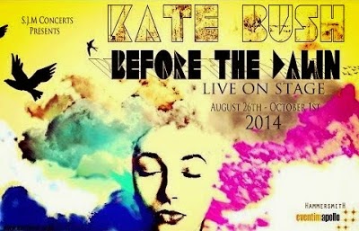
I will display a few illustrative posters used for advertising various Kate Bush shows, and albums.

http://www.thestar.com.my/~/media/Images/TSOL/Photos-Upload/From%20DCX/kate%20bush.ashx/?w=620&h=413&crop=1& < image reference at this link.
http://galleryplus.ebayimg.com/ws/web/190831455351_1_0_1/1000x1000.jpg < image reference at this link.
https://blogger.googleusercontent.com/img/b/R29vZ2xl/AVvXsEjbwDPyYsBTg3-gKKh_FWXmnMnKghqki2xQi8Bgo-elmM-bRB95fUC1DaAqgyDqLw_LYcP86RMrzQvNVqKL839-f7Hi2GHQ32TeEyDBhmeqcQ7YkuMhbkIEmreKGjion8pD7tUOhHzS8ccL/s400/BeforeTheDawnPoster-2.jpeg < image reference at this link.
I have noticed that some of Kate Bush's advertising has an abstract/and or experimental theme, like image 3 for example.

This in a way matches some of her existing album covers, in terms of theme.

http://991.com/NewGallery/Kate-Bush-Never-For-Ever-91475.jpg < image reference at this link.
http://covers.box.sk/newsimg/dvdmov/max1318154791-front-cover.jpg < image reference at this link.

I would like for my poster to run along a similar theme to the final album cover artwork, as I would like them to work as a pair.

My album cover will carry the theme of nature and paranoia, which I have taken from my interpretation of the album.
However I may look into incorporating other themes found on the album.
A theme that springs to mind is one of weather. 
When listening to the song 'The Morning Fog', it makes me think of dew, and mist.

I took some photos myself of my local environment shrouded in mist to perhaps give me a little bit of inspiration.


Durham was very beautiful shrouded in early morning mist. 


Thomas.