I will be using my previous research to come up with a few concepts of possible designs that I can progress with toward my final cover.
 |
| My previous research on several album cover styles. |
I will start by creating some rough concept ideas that match the contemporary style, as stated on the brief.
I will be using the research from previous blogs, and I will note that many of the concepts featured in this blog may not necessarily be implemented into the final cover, this is just solely for the use of my development, and to gather ideas to take onto the next concept stage.
I may end up taking certain elements from a few concepts, and combining them to make a final cover.
I have decided that the classic use of photography/portraiture won't work for me when developing the album cover.
I feel as if this theme has been overdone, and I would prefer a more creative challenge, especially since this is an illustration module.
Over the past few days, I have been attempting to 'break the album into chunks', by picking out strong, major recurring themes that I have found.
I have done this by studying lyrics from many of the songs on the album, and also continuously listening to the album on repeat.
I really do like the theme of nature, and I have found that a lot of Kate's songs have some connection to it.
For example, in her 'Wuthering Heights' music video, the entire performance is all outdoors, and a few of the songs on my album choice, refer to nature. For example, with songs such as 'Under Ice', 'Hello Earth', and 'The Big Sky'.
She seems like a 'natural' person in my opinion.
Whilst reading the book that I recently picked up on Kate Bush, called "Under the Ivy, The Life And Music of Kate Bush', I discovered that she used to hand small vials to her close friends, that contained natural elements such as twigs, dirt, and other elements.
I have also noticed a theme of paranoia in a few of her tracks on the album.
Such songs as 'Hounds of Love' for example, carry this theme.
In the lyric "Coming for me through the trees, help me someone, help me please", this can be noticed.
It makes me wonder what exactly the 'thing' coming for her is.
 |
http://www.discogs.com/viewimages?release=508248 < image reference at this link.
|
I may find it hard to choose one particular style, so I thought I could try combining a few styles together, in similar ways as to what I have experimented in the past, from module one and two.
I will base my concept covers on the music from 'Hounds of Love'.
I looked at the album in depth in my blog entitled, 'Analysing the 'Hounds of Love Album'. There I discuss a lot of the songs, and also provide links to the music videos.
-----------------------------------------------------------------------------------------------
Concepts:
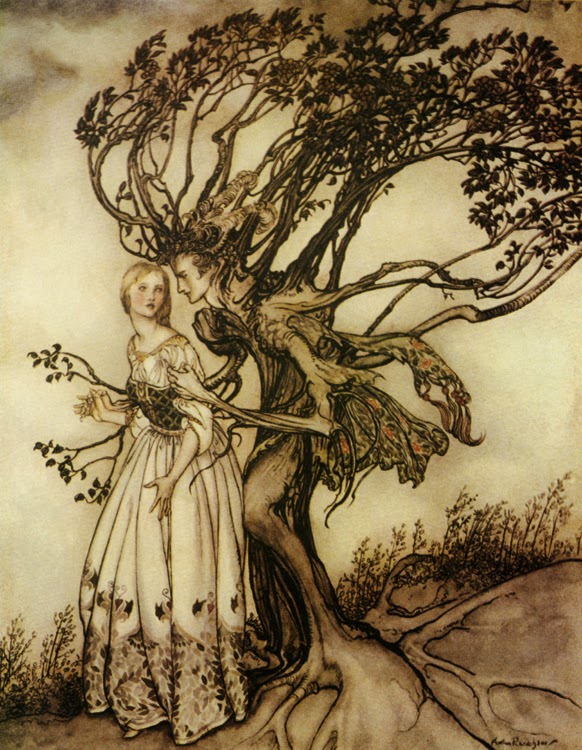
For concept #1, I took inspiration from both Arthur Rackham, with his surreal look, and also from Kerby Rosanes, with his single-tone use of ink pens.
 |
| Initial pencil base. |
 |
More advanced version, nearing completion.
The completed illustration trial.
|
The globe I thought could signify isolation, whilst the clouds could refer to the songs, 'Cloudbusting' and 'The Big Sky'.
The eye in the middle of he design is actually modelled off Kate's, I used the image below for reference for this.
The eye refers to the song, 'Watching You Without Me', as well as the themes of paranoia and being watched, found notably in the song 'Hounds of Love'.
The eye is also looking into a telescope, which is on the north eastern hemisphere of the globe.
The telescope is looking out for the 'thing' coming 'through the trees', in the midst of the darkness, and symbolises the fear of the unknown,
The telescope and the dark night sky full of stars also references the song 'Hello Earth', as these elements refer to a few space themes that I have noticed in this song.
The song also includes some NASA audio samples.
The text style in this concept, I thought was good at the time, it is very eye catching against the black background.
However on second thoughts, I now think that it looks rough, and would probably work on for example, a rock or metal album, rather than her genre.
 |
| http://georgesjournal.files.wordpress.com/2010/09/kate_bush_eye.jpg < image reference at this link. |
It is based on an idea that I came up with last night, it just popped to mind and I thought I would attempt it.
-----------------------------------------------------------------------------------------------
In the second very rough concept, I used my finger to paint with, (as you can see below), and it only took a few minutes to piece together. This piece is more simplistic than the last trial, but is more colourful.
Despite it being very simple, I feel like it shows a lot of emotion in its random and rough brush strokes, its almost as if it is a representation of what 'Hounds of Love' is trying to convey visually.
I believe that this track is all about struggle, with Kate's character seemingly perhaps wanting freedom, almost as if she is breaking the rules in order to get away from the men. (The men could suggest multiple things, this is purely my speculation however).
This style of cover gives the impression that the lines and colours aren't bound to each other, and that things can be different, this is solely what I think anyway.
In my previous Narrative Illustration module during year one, I experimented a lot with combining traditional mediums with the digital style.
 |
| Work from my previous narrative module. |
The illustration above was created by initially sketching the base. By painting the image using watercolour paint, and scanning it into photoshop, I was then easily able to alter the colours in CYMK, as well as adjust the exposure, contrast, and sharpness.
I could look at going down a similar route in order to produce my final Kate Bush 'Hounds of Love' cover. My current style of painting seems to suit the children's market more, and this is making me think it may not fit with her style.
However, coupling my style with digital manipulation, it appears contemporary, (the image above is a great example of this).
-----------------------------------------------------------------------------------------------
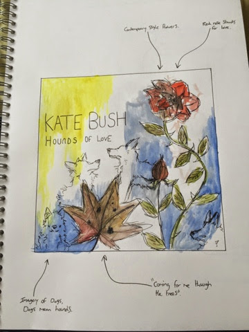
 |
| Earlier version of the concept. |
In the next concept, I took a lot of symbolism from some of the key lyrics, and visually interpreted it onto the cover. As you can see through the arrows, I have highlighted this.
This concept again took on the inspiration of both Arthur Rackham, but this time I took more influence from Kerby Rosanes' style.
I love the style of his work, as it appears simple yet is able to clearly provide the message behind the cover.
-----------------------------------------------------------------------------------------------
Using my book on contemporary illustration, I looked at the section that looked at plants and flowers.
The imagery of hounds are a clear reference to the title of the album.
 |
I took this book out of the library, in order to get a better look into contemporary art.
|
-----------------------------------------------------------------------------------------------
In this concept, I arranged a large number of contemporary stylised eyes into the figure of Kate bush's head.
I love how this concept has a slight theme of portraiture, however in a very different sense.
I have noted what each part of the concept means in connection to the album.
-----------------------------------------------------------------------------------------------
This concept is based all around the song, 'Running up that Hill'. I wanted to go with a simplistic visual appearance, and I looked to design a concept that used a very strong contrast.
This contrast can be seen as there are sharp differences between the black and white, as well as the text, with the artist name in black, and the album title in white.
-----------------------------------------------------------------------------------------------
-----------------------------------------------------------------------------------------------
For this concept, I continued with the theme of paranoia, but allow for the typography to work with the illustration. I love this style, I think that it is very bold, and the black background allows the eyes to be drawn to the contrasting white middle, where the illustrations are featured.
The only thing that I don't like about this style, is the name of the album, which draws the attention away from the centre.
This could be refined by allowing the album title to also be incorporated into the illustration, in the same way as how Kate Bush's name is displayed.
-----------------------------------------------------------------------------------------------
It goes for all drafts that I produce when I say, that these are just rough representations of ideas that I can progress with. I am trying to come up with as many as I possibly can, because the more concepts I produce, the better my final cover can be.
I know the importance of concepts in illustration.
I also must take into account the back cover of the album, as this is just as important as the front.
It is usually where the track list is found, as well as all of the copyright information.
It will of course be the same/similar theme to my front cover, so I will work on the front design first.
I will be using these concept designs to also help inspire the design for the back cover.
I want to create a back cover that compliments the front.
Thomas.